4.4 基于某公司真实销售数据集的预处理与汇总统计案例
对于tidyr包和dplyr包的主要函数我们都做了说明,接下来我们将用到以上章节的知识对本章用到的数据集进行简单的数据分析。这是一份销售数据集,我们可以通过对数据集的分析,了解不同市场、产品的销售情况,从而指导销售策略。我们进行数据分析一定是要带有目的性的,这样我们才能我们需要进行哪些分析。
首先,我们要加载需要用到的包。
library(ggplot2)
library(tidyverse)
library(ggthemes)
首先,这是一份全球性的数据集,有若干个细分的销售区域。我们可以将数据集按照销售区域进行分组,然后求出各个市场的总销售额,然后我们对其进行排序:
orders %>% group_by(market) %>%
           summarise(totalsales = sum(sales))%>%
           arrange(desc(totalsales))
## # A tibble: 7 x 2
## market totalsales
## <chr> <dbl>
## 1 亚太地区 3585744.
## 2 欧盟 2938089.
## 3 美国 2297201.
## 4 拉丁美洲 2164605.
## 5 EMEA 806161.
## 6 非洲 783773.
## 7 加拿大 66928.orders %>% group_by(market) %>%
summarise(totalsales = sum(sales)) %>%
ggplot(., mapping=aes(x = market, y = totalsales)) +
geom_bar(stat='identity') +
xlab('市场') + ylab('总销售额')+
theme_economist()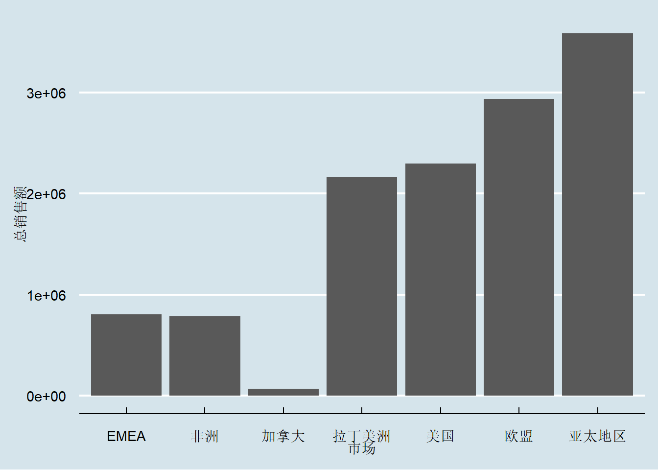
图 4.1: 各市场销售额统计
单纯的数据不够直观,我们可以将其可视化:
orders %>% group_by(market,type,segment) %>%
           summarise(totalqty = sum(quantity))
## # A tibble: 63 x 4
## # Groups: market, type [21]
## market type segment totalqty
## <chr> <chr> <chr> <dbl>
## 1 EMEA 办公用品 公司 2238
## 2 EMEA 办公用品 家庭办公室 1414
## 3 EMEA 办公用品 消费者 3826
## 4 EMEA 技术 公司 692
## 5 EMEA 技术 家庭办公室 333
## 6 EMEA 技术 消费者 1234
## 7 EMEA 家具 公司 585
## 8 EMEA 家具 家庭办公室 384
## 9 EMEA 家具 消费者 811
## 10 非洲 办公用品 公司 1967
## # ... with 53 more rowsy_axis_formatter = function(x){
return(paste(x/1000,'K',sep=""))
}
ggplot(orders, aes(x = segment, y = quantity)) +
geom_bar(stat='identity') +
facet_grid(type ~ market) +
scale_y_continuous(labels=y_axis_formatter) +
xlab("细分市场") +
ylab("数量") +
coord_flip() 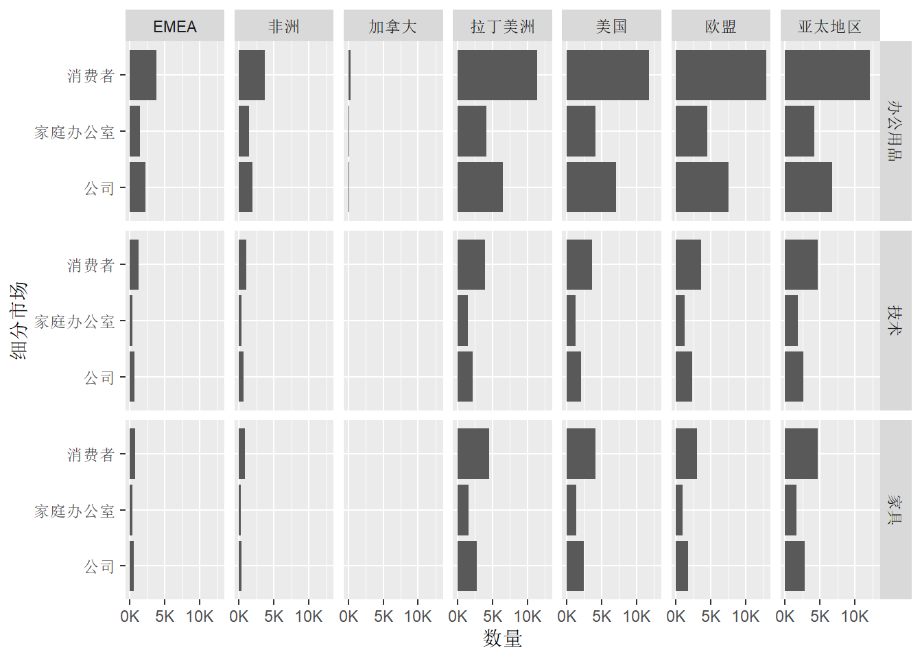
图 4.2: 各区域细分市场销售数量统计
orders %>% group_by(custname) %>%
           summarise(totalsales = sum(sales)) %>%
           top_n(5, totalsales)
## # A tibble: 5 x 2
## custname totalsales
## <chr> <dbl>
## 1 贺鹏 40475.
## 2 黄丽 51928.
## 3 吕欢悦 38365.
## 4 唐婉 40488.
## 5 田谙 50732.orders %>% group_by(custname) %>%
summarise(totalsales = sum(sales)) %>%
top_n(5,-totalsales)## # A tibble: 5 x 2
## custname totalsales
## <chr> <dbl>
## 1 程德 4115.
## 2 方蔓楚 5461.
## 3 秦黎明 5325.
## 4 熊宣 5328.
## 5 余雯 3892.我们已经在空间上对数据集进行了统计汇总,接下来我们可以按照时间序列对数据集进行统计分析,绘制该公司的年、季度和月份销售额变化曲线,计算同比变化率,从而了解该公司的年度销售情况变化。
首先我们按照年份汇总销售量,并使用ggplot2将其可视化:orders %>% mutate(year = lubridate::year(purchasedate)) %>%
group_by(year) %>%
summarise(totalsales = sum(sales)) %>%
ggplot(., aes(x=year, y = totalsales)) +
geom_line()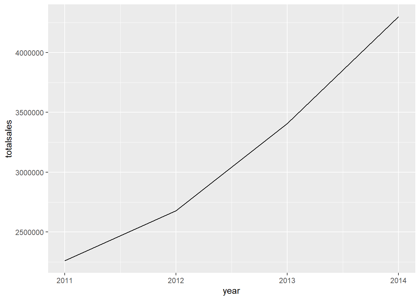
图 4.3: 年销售额统计曲线
orders %>% mutate( year = lubridate::year(purchasedate),
                     quarter = lubridate::quarter(purchasedate)
                   ) %>%
        group_by(year,quarter) %>%
        summarise(totalsales = sum(sales)) %>%
          ggplot(., aes(x=year, y = totalsales)) +
             geom_line() +
             facet_grid( .~ quarter)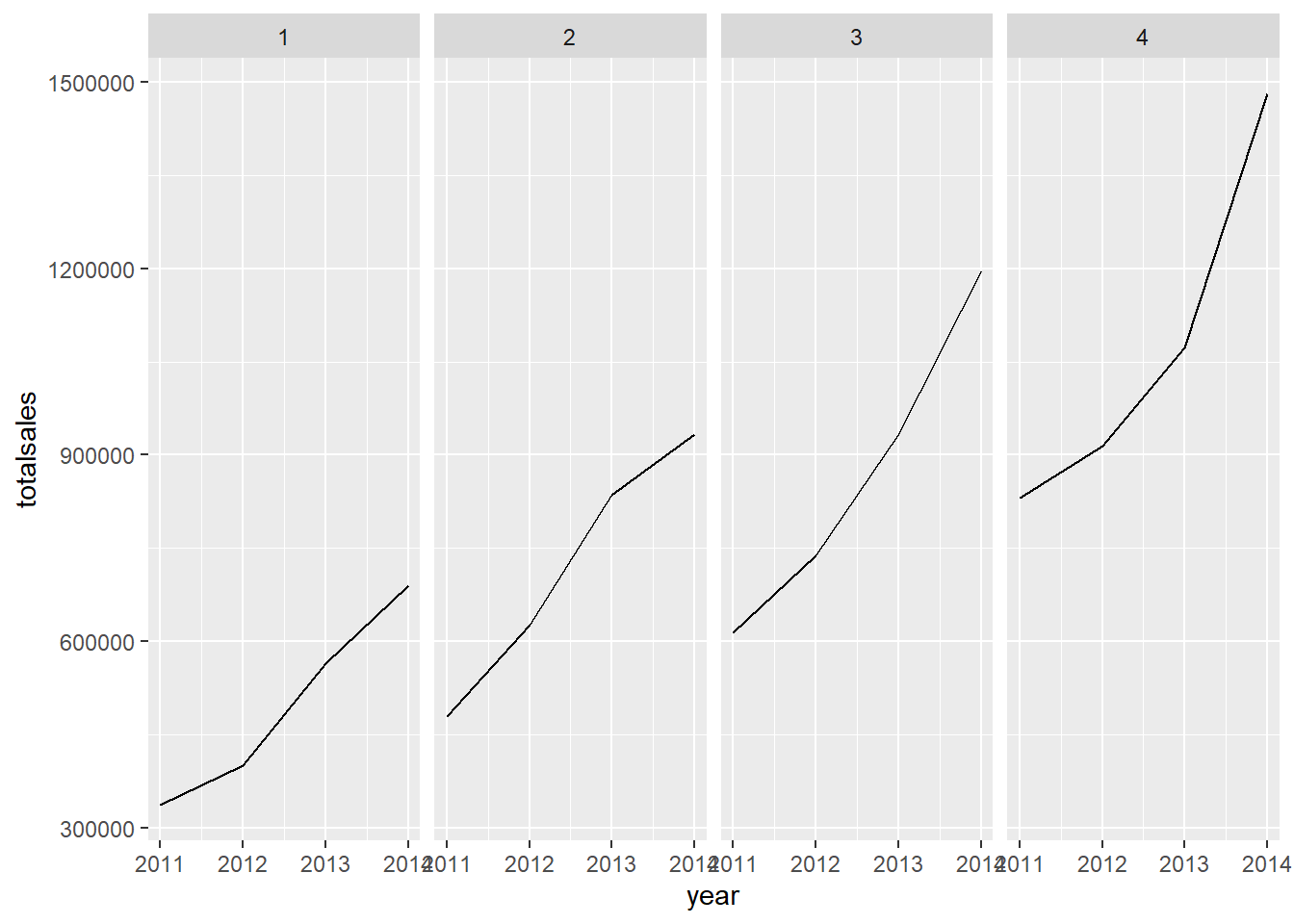
图 4.4: 不同季度销售额统计曲线
orders %>% mutate( year = lubridate::year(purchasedate),
                   month = lubridate::month(purchasedate)
                  ) %>%
           group_by(year,month) %>%
           summarise(totalsales = sum(sales)) %>%
              ggplot(., aes(x = month, y = totalsales,
              colour = factor(year))) +
              geom_line() +
              scale_x_continuous(breaks=1:12)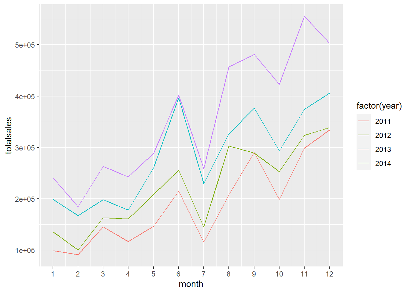
图 4.5: 月销售额同比变化曲线
orders %>% mutate( year = lubridate::year(purchasedate),
                      month = lubridate::month(purchasedate)
                   ) %>%
           group_by(month,year) %>%
           summarise(totalsales = sum(sales)) %>%
           mutate(ratio=(totalsales -
                         lag(totalsales))/lag(totalsales)) %>%
              ggplot(., aes(x=month, y = ratio, colour=factor(year))) +
              geom_line() +
              scale_x_continuous(breaks=1:12)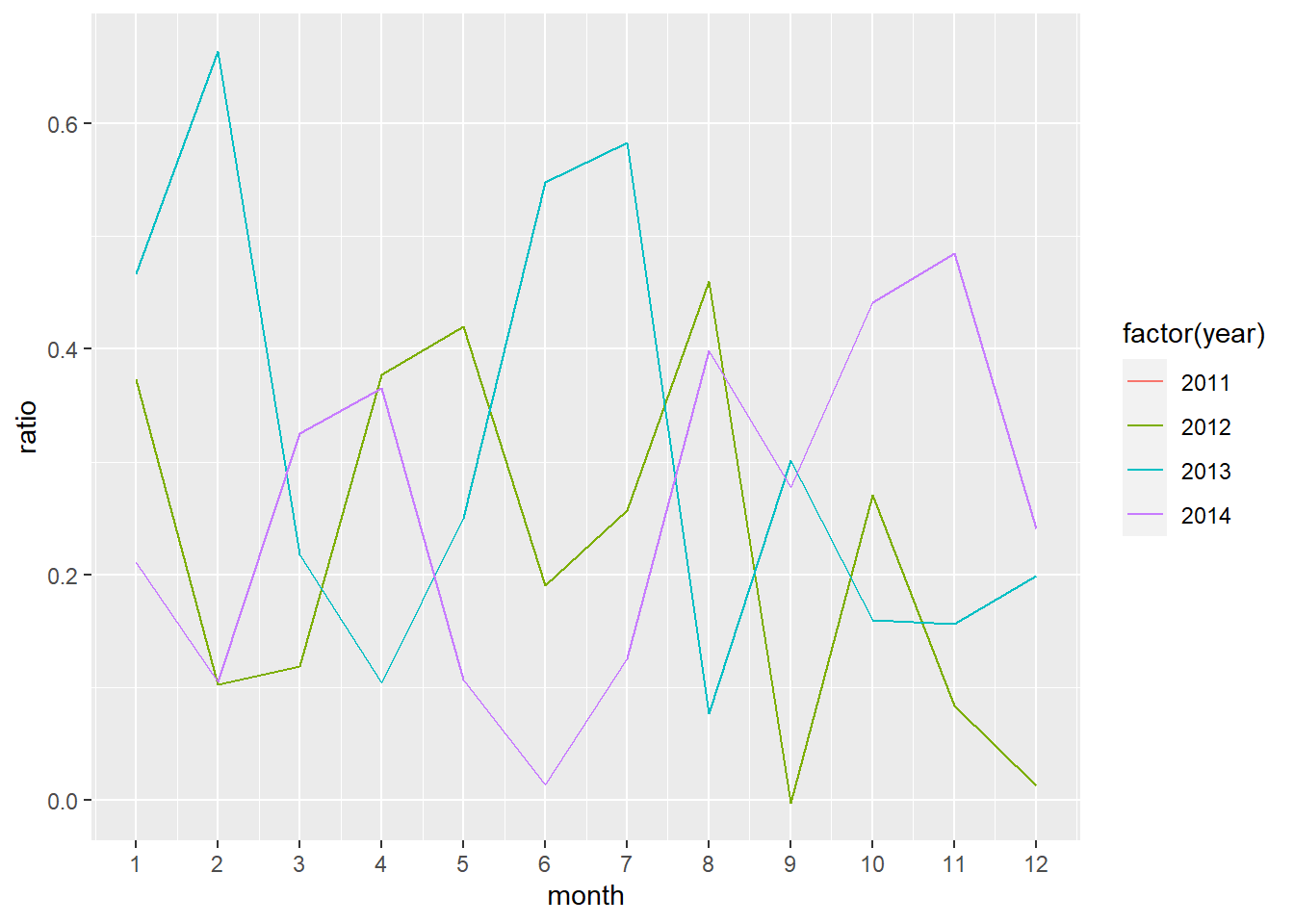
图 4.6: 月销售额同比变化率